
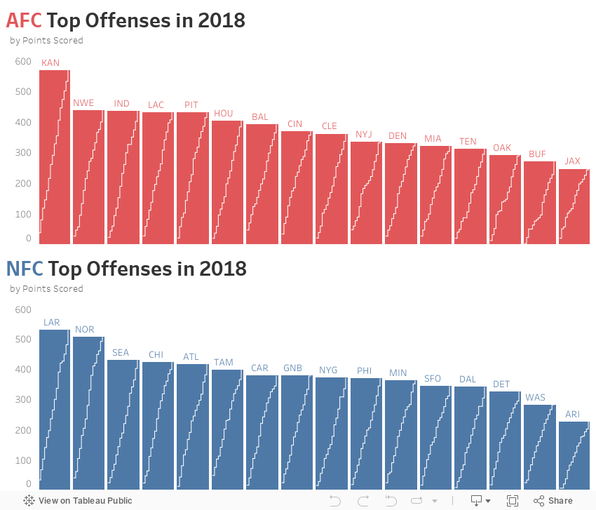
One major application is when comparing totals across discrete variables as well as comparing running totals at a further level of detail. One such example is above. It shows points scored by NFL team by conference. The major pre-attentive attribute is the bar showing total points scored. The secondary pre-attentive attribute is the line within the bar showing a running total of points by game. This is similar to the example in the original post. The original shows a point in time comparison of a variable as well as multiple time points within the spark line.