Tableau 2020.4 allows you to stack multiple layers on the same worksheet. This feature is built mostly for maps (see Marc's article here) but you can also do it for other chart types (see Jeff's article here). Also see my previous post on stacking different KPI chart types.
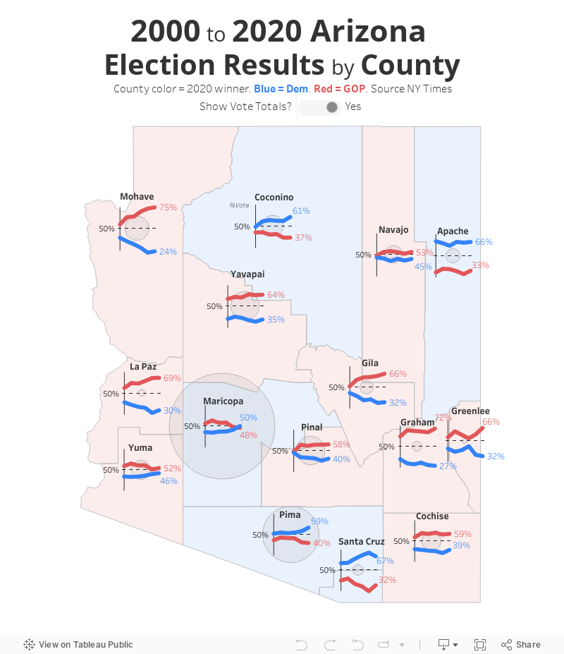
This viz below is a single worksheet that has 7 layered marks: a y-axis line chart, a 50% reference line, one GOP voting percentage line, one Democrat voting percentage line, one polygon fill map by county, one total vote population dot triggered by a parameter and one county label. The line chart shows presidential voting by party over the last 6 elections.