
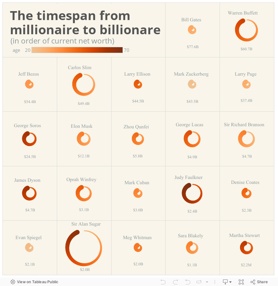
Sonja Kuijpers of STUDIO TERP made this very beautiful and creative viz as part of the Andies (Kriebel and Cotgreave) Makeover Monday challenge. The challenge was to remake this viz displaying the age when millionaires became billionaires. What Sonja made was so unique and different that I immediately thought about how to create this in Tableau.
Which I did below. This version is not as clean as Sonja's obviously. But I am going to walk you through how I created this in Tableau. See details after the jump.
Which I did below. This version is not as clean as Sonja's obviously. But I am going to walk you through how I created this in Tableau. See details after the jump.
In order to create this view you first need to structure the data properly. For this I needed to create a circle for every rich person. In order to create these circles I needed points along the circumference which would be my X (column) and Y (row) coordinates. These X and Y coordinates were created with the following parametric equation in Excel:
- X1 = SQRT(2) × SIN(A1 × PI() / 180)
- Y1 = SQRT(2) × COS(A1 × PI() / 180)
Here is what the plotted circle looks like with my X and Y coordinates from Excel in the column and row shelves respectively. Then change the chart type to line and add [Circle ID] to the path shelf.

I then have to modify the radius of each circle. In Sonja's viz the size of the circle equates to the number of years between becoming a millionaire and billionaire or the field [Years from M to B]. The larger the circle the more years. So in Tableau I created a new X and Y coordinate as X2 and Y2 where the formula is ([Years from M to B] * [X]) and ([Years from M to B] * [Y]). Then, in Tableau I place X2 and Y2 into the column and row shelf respectively.
Next, the color of each point on the circle in Sonja's viz roughly equates to their age; light orange is younger (20 years old) and dark orange is older (70). To create the effect of the color changing along the circle in Tableau I create another calculated field. The new [Color] field has the following formula: (([Years from M to B]/60)*[Circle Id])+[Millionaire Age]) where [Circle ID] is a number from 1 to 60 representing a point on the circle's circumference sequence in clockwise order from the top of the circle. Finally the thickness of the line is just the [Circle ID] field (1 to 60). Here is where we are:

The chart in Tableau is a line chart where the path is the [Circle ID] field. The circles are nested or trellised to be positioned on a 5 x 5 grid like in Sonja's and sorted by net worth using custom groups I created in Tableau. Finally, I filtered out the the top 4 points on the circle to create the space between the start (millionaire age) and end (billionaire age) points on the circle.
Here is a link to the data file in Excel which contains the formulas and data structure. Let me know if you have any questions in the comments below. Thank you Sonja for the inspiration.