
Another issue is that the inputs for these variables is based on an ordinal scale so some points have identical values. This means that some points can be stacked on top of one another. This makes it hard to get an accurate sense of the distribution of the points for each of these variables which is very important.
So these are the most important considerations when creating this chart:
- Needs to show the value of two discrete variables for a specific point
- Needs to show the relative distribution of all points
- The relationship between these two variables is not important
- Some points have identical values for both variables
- The audience for these charts is varied so a box-plot might be too complex
So given this information which chart would you recommend? Here is a mock up of the original chart my client made and my proposed solution with fake data in Tableau.
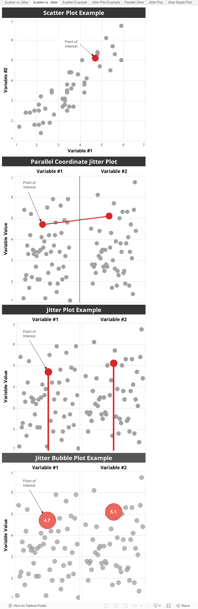
I proposed a parallel coordinate jitter plot. This allows you to clearly see the distribution of the data and compare the value for the two variables on the same scale. It also subtly highlights the comparison of the two variables for the specific points with the connecting line which is of ancillary value. It also avoids stacking points. But the x-axis could be confusing since it is a randomized.