To compare I created both chart types in Tableau using some data from the my analysis of Victor Cruz's market value I did a few weeks ago. Both chart types show Victor Cruz as compared to his peers in 5 different normalized statistical categories. Radar charts are not a native chart type in Tableau so I had to get creative. See instructions for creating after the jump.
Click the image to open in Tableau.
The two charts show 5 wide receiver stats: yards per reception, percent of team's receiving yards, percent of team's receiving touchdowns, percent of team's receiving targets, and percent of team's 3rd down conversions when passing. All variables have been normalized for a consistent comparison. The lines represent a wide receiver. This chart shows Victor Cruz and his top 25 peers based on these variables. Change the drop down to switch the line highlighted in orange.
Radar charts are visually more interesting but it is more difficult to compare the lengths across the "spokes" because they are on uncommon axes. Whereas with the parallel coordinate chart comparison across variables is easy because all variables share a common axis. Both chart types are impacted by the order of the variables because altering the sequence of the variables can tell entirely different stories. Another thing I don't like about radar charts is people are inclined to interpret the pentagon's size and compare area. However, Linc points out that people may also misinterpret a parallel coordinate chart as a line chart and assume the direction of the line is a trend.
As you can see both chart types have their strengths and weaknesses. But play with both charts and then vote in the poll to the right on which chart type you like best for displaying multi-variate data.
How to create radar charts after the jump...
Creating Radar Charts in Tableau...
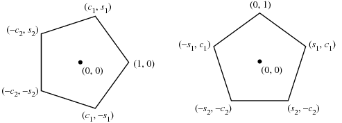
Radar charts are not native to Tableau but it is rather easy to create one. The above chart is just a scatter plot where I set the x and y points to correspond to the perimeter of a pentagon. I chose a pentagon because I wanted to show 5 variables but generally any shape is possible.
First you need to do some work on the data on the backend to plot your points on a pentagon. To get each vertice on the pentagon I started with a common reference point (0,1) which would be my first variable (yards/rec) then plotted the corresponding points at the other 4 points. This site helped me get my formula.

c1 =
c2 =
s1 =
s2 =
This gives us the outer perimeter of our pentagon. For example, yards per reception is at point (X=0, Y=1), percent of receiving TDs is at point (X= S1 = 0.951, Y= C1 = 0.309) and so forth and so on. This gives us the farthest possible point on each of these spokes which would correspond to the highest normalized value for all players for that stat which is equal to 1.
For all other players we multiply their normalized value for each stat times the vertice. So for example, if Dwayne Bowe averages half as many yards per reception as Victor Cruz (the highest of these 25 players) his normalized value for that stat would be 0.5 given that Cruz's value is 1. So we multiply that times the vertice for that stat (0,1). So, 0 times 0.5 is zero and 1 times 0.5 so his x/y coordinate for that variable would be (0,0.5). You do that for every player for all 5 variables. Your data set should have four columns: player name, variable name, x-coordinate, and y-coordinate.
Once we have the data set up properly we can bring in to Tableau. Place your x-variable in the column shelf and your y-variable in the row shelf. Then place your variable name in the line mark shelf. This connects all of the points around the pentagon so that each line represents a player. I added a dynamic color and line thickness using a parameter tied to the player name but this isn't necessary.
Hope this made sense. But download the workbook to see for yourself. Post any questions in the comments section below. Thanks.
- Adam

