
Every visualization uses the same data on tropical storms and is the same size. For the most part I used the same fields and color palette as well. This ensures the driving difference in the visualization is the medium not the data or size. The final products vary greatly obviously. See a comparison of the 3 mediums below as well when and why to use each approach.
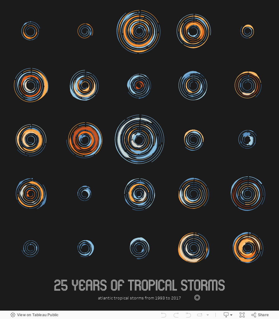
On one end of the data visualization spectrum is data art. Data art is the most abstract and beautiful form of data visualization. When I think of data art I generally think of talented people like Giorgia Lupi who makes beautiful data visualizations that do not follow the typical data visualization conventions and more closely resemble art. So in my attempt to produce data art with the tropical storm data I wanted to make something abstract. See the image below and click for the interactive.
Medium 1 Data Art


The data art was the easiest to create once I had a sketch. The only thing I had to do was some basic math to calculate the X and Y values to display the change from the origin point. The rest was pretty easy to create in Tableau. Ken Flerlage helped provide me some feedback. I created a few alternatives. See one below. This version shows every storm as a line on a circle with the length and color as duration and the thickness as wind speed. In this version it is easier to see the number of storms by season.
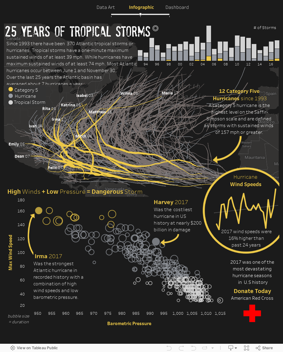
When I think of infographics I think of people like Nadieh Bremer and Jonni Walker (who helped me out). An infographic combines more traditional data visualization forms with strong design and layout. The infographic was the hardest to create. It took a long time to get something I didn't hate. Thank you Jonni for your help.
Medium 2 Infographic


I also spent a ton of time on finding a specific story. With the data art I wanted to convey the macro pattern while the dashboard is best for exploratory analysis. The infographic best lent itself to telling a story. The story of 2017 and specifically Harvey and Irma was best told in this visualization. And the call to action was better suited here than anywhere else. But I really appreciate how talented Jonni Walker is now given how challenging this medium is.
Finally, the dashboard was relatively easy to make. This is probably because I have the most experience in this medium. When I think of dashboard design I think of Stephen Few and Steve Wexler. This combines multiple conventional data visualization styles to most efficiently and accurately be able to understand data.
Medium 3 Dashboard

Overall, this project gave me appreciation for the challenges of each medium. Some mediums are more difficult than others. And some are better suited for different audiences and objectives. Here is my breakdown of each medium type.

Ultimately, the driving difference between each medium is the audience. As Steve Wexler, Jeffrey Shaffer, and Andy Cotgreave state in the Big Book of Dashboards the purpose of business visualizations including dashboards is to create visualization for the "largest audience provide the greatest degree of understanding with the least amount of effort". Dashboards are for accurately communicating data to enhance understanding. But, in my opinion dashboards generally have a specific or at the very least a known audience. Infographics are meant to engage a broader, perhaps ill-defined audience in order to tell a story. It should be accurate to foster understanding but engagement via a compelling aesthetic is more important than in a conventional dashboard. Data art however can have no defined audience. It can be art for art's sake. Therefore it can further emphasize aesthetic over understanding or accuracy.
Please let me know your thoughts and feedback in the comments below. Thanks.