
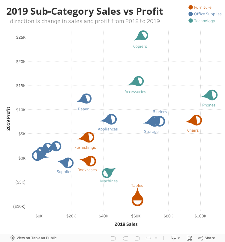
The primary message in the above example is sales vs profit by product sub-category. The color indicates product category and the direction or angle of the tadpole is the change from one year to the next. With the tadpole you can easily see which product sub-categories are improving up and/or right versus getting worse down and/or left. You can hover over to see the comet pattern which mirrors the direction of the tadpole.
Here is a comparison with another example. This chart is showing employee performance for 2 variables: impact (x-axis) and quality (y-axis). The tadpole scatter shows the x and y position and the direction or angle of the tadpole shows the change from year to the next. It is easier to see the difference between Eli and Saquon. These two have similar scores but Eli is trending up and Saquon is trending down.

These patterns are harder to see in a traditional scatter. You can see 2019 performance clearly but no difference between how these employees have changed over time. So it is harder to contextualize their annual performance as a sign of improvement or not.

