
However, the visual display of a dashboard can vary significantly depending on what conditions you want to monitor and for who you're trying to facilitate understanding. The type of dashboard you need depends on a number of factors including who will use it, how it will be used, how often, and in what medium. Some dashboards are simple and explanatory meant to be viewed quickly without much context. Other dashboards are very detailed and complex meant to be explored.
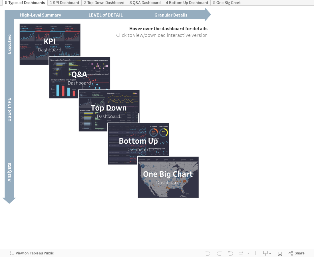
In my experience, there are generally five types of dashboards:
This article provides an overview of each type of dashboard, when to use each, and why. Click each image for an interactive, downloadable version in Tableau using SuperStore Sales data. Every dashboard does not fit neatly into of these types. But by grouping them this way I hope to emphasize the importance of considering the audience, use case, update frequency, and delivery mechanism for each dashboard you create.
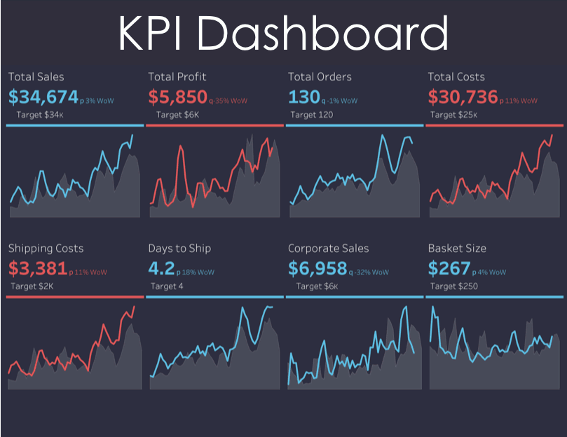
KPI Dashboard
The KPI dashboard is a compilation of disparate visualizations used by executives to easily monitor the most important metrics in the organization. This dashboard typically provides less detail or context than other dashboards. It is generally viewed on a regular basis, at a glance. It is good for providing quick what, where and when information that others will then go action on or investigate. This dashboard type is not good for more complex why and how questions because it is not good for exploratory analytics.
Q&A Dashboard

click for interactive dashboard
Top Down Dashboard
The Top Down dashboard is focused on a single topic and shows high level, aggregate KPIs as well as specific details that could provide more context or insight. This dashboard type is good for focusing on a specific segment of an organization. Users can monitor a key metric at glance and/or drill into why a pattern might be occurring. It is good for organization leads like VPs or Directors and middle management who are responsible for overseeing or managing a discrete component of an organization. It is not good for presenting a comprehensive view of complex organizations because the dashboard can easily become overwhelming.
 click for interactive dashboard
Bottom Up Dashboard
The Bottom Up dashboard provides granular details on a topic then allows users to view those details in context or in aggregate across the broader organization. This type of dashboard is good for middle management or analysts looking to monitor patterns at a very detailed level. The performance of specific data points is more important than the aggregate performance of all of the data points. This type of dashboard is good for identifying specific issues that require action or intervention. It is not good for seeing a comprehensive view of the organization or monitoring key questions at a high level.
click for interactive dashboard
One Big Chart Dashboard
The One Big Chart dashboard shows a single visualization with the ability to filter or drill down. This is usually a map or scatter plot; a data dense visualization that requires a lot of screen real estate to render all of the details clearly. This type of dashboard is good for analysts to monitor or visually analyze specific issues and patterns across a large number of data points. The analyst would presumably have a strong understanding of the data and context of what is being presented. This type of dashboard is not good for seeing aggregate patterns across an organization or easily answering specific questions. It is also sometimes difficult to interpret the details in a broader context.
click for interactive dashboard
In conclusion these dashboard types are not comprehensive or perfect. The right type of dashboard should be based on your users and your message. This chart illustrates where each dashboard type described above falls on those spectrums. Your dashboard most likely falls somewhere within as well.
A big thank you to Jeffrey Shaffer and Steve Wexler for their feedback on this post.