
For this example I used Superstore Sales; The best damn dummy data set in town. This gauge will show sales by Product Sub-Category relative to one another. So we start with Sub-Category [Sales].

Then we have to normalize sales to put it on a 0 to 1 scale. So I create a new calculated field called [Sales%] using the following formula:


We will use this new field [Sales%] to create the X and Y coordinates which points the gauge needle to a point on the circumference of the gauge. For this gauge I am only using 180 degrees or a semi-circle from 9 o'clock to 3 o'clock on a watch face. Gauge ranges vary. To adjust the angle you simply need to adjust the number 180 in the below calculated field. To create the X and Y calculated fields I use a parametric equation with the [Sales%] field above. For now I am calling these fields [X All] and [Y All]


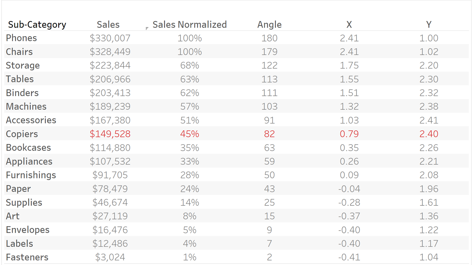
Sales x 180 essentially creates an angle such that the highest point is at 180 degrees and the lowest at 0 degrees. Now we have the following fields.

When you place [X All] in the columns shelf and [Y All] in the rows shelf then set the calculated field to compute using Sub-Category we get something that looks like this. Beautiful I know. All Sub-Categories are positioned from left to right, lowest to highest sales along the circumference.
When you place [X All] in the columns shelf and [Y All] in the rows shelf then set the calculated field to compute using Sub-Category we get something that looks like this. Beautiful I know. All Sub-Categories are positioned from left to right, lowest to highest sales along the circumference.

But we want a single point for each Product Sub-Category. To do this we will need a parameter to identify the specific point we want to show. So we create a parameter called Sub-Category with the same fields as Product Sub-Category. The fastest way to do this is to right-click on the dimension Sub-Category and select Create > Parameter.
Then we need to tie our X and Y coordinates to this parameter to only show a single point. So we modify the [X] and [Y] measures slightly. In addition to only showing the coordinates of the selected Sub-Category we also need a fixed origin point; in this case 1,1. This places all points not tied to the parameter at the origin point. Which we will use to create the line of the gauge.


Now we have the measures we need. We place the new [X] and [Y] measures into the columns and rows shelves respectively. Then set the calculated field to compute using Sub-Category and set the mark types to line. The new point on the circumference is tied to the parameter and the rest of the points are placed at the origin point (1,1).
We are almost there. Add a background image with shaded reference points setting the X field to X and the Y field to Y. The left is set at 0.5 and right at 2.5. The bottom at 1 and top 2.5 I created this one in PowerPoint using pie charts. This unfortunately makes the context points for the chart stagnant.

Finally, format the Tableau elements as you set fit. I thickened the bar, changed the color, and added a white border. I then added some labels and legends.I hope this is helpful. Please let me know if you have any questions in the comments below.